Dan's Papers Cover Artist Joe Chierchio Conjures 1940s to Ring in 2016
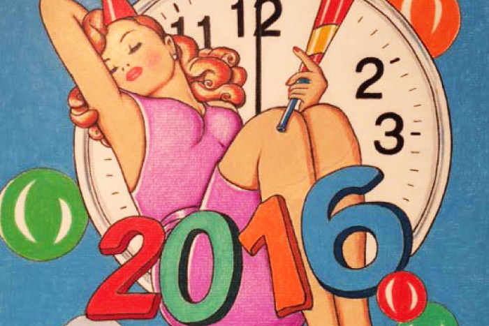
This week, frequent Dan’s Papers cover artist Joe Chierchio celebrates the end of 2015 and the coming of an exciting new year in 2016 with a sexy 1940s style pinup girl. The graphically strong image is a result of the artist’s keen talent for composition and color gained from his four decades as art director for Grey Advertising in Manhattan. Beyond the formal concerns, Chierchio conjures a perhaps nobler but no less difficult time in America—when, as a child, he lived near the Brooklyn Navy yard and watched massive aircraft carriers and destroyers being built for the war effort in Europe and the Pacific. It’s history, beauty and a hopeful nod to the future, all in one.

You’ve done a lot of Dan’s Papers covers. Do you know how many?
This is 23 but who’s counting? I’m trying to catch up to Michael Paraskevas.
Tell me about this cover, your choice to use the girl and this visual style.
I wanted to capture a feeling of early 1940s pinup girls…Betty Grable, Lauren Bacall, Rita Hayworth, Veronica Lake…The GIs in the Second World War hung them in their lockers. A soldier would look at these pictures and feel so nostalgic. A sexy version of the girl next door—it was a moral booster. They felt like they were home. Nine million Esquire magazines went to the troops from 1942–46, free of charge. It was an amazing time.
You’ve talked a lot about the importance of the “idea” and your love of form. Narrative is clearly a vital element of what you do, but it couldn’t be communicated without good form, at least in the case of visual art. Can you talk about these things and how they intersect for you?
For me the idea always comes first, then the execution. Design, form and composition are the key. It’s like trying to build an exciting building without an exciting plan. I used to tell my advertising students [at NYC’s School of Visual Arts] to execute the idea not the execution. I spend a lot of time coming up with the idea and composing the picture—that’s probably what I’m best at.
Form is also very important in my work. I used to be a stone carver. Sculpture is all about form. I love when I’m designing rounded forms. Rounded shapes are very sexy.
What does an artist have to do to make something go beyond simply being a pretty picture? How can you tell when you’ve made something of substance rather than simply a decorative piece?
When it has a meaningful message. Not an empty picture. I love to tell a story, I love a narrative. I’m more of a writer or director than an artist—I love those moments. Like Norman Rockwell—he’s one of my heroes. He was a photo realist before it even existed. Rockwell did over 350 covers for The Saturday Evening Post.
You use colored pencils almost exclusively—with a bit of watercolor or opaque black or white paint from time to time. Is your chosen medium a result of your days in advertising? How did you land on pencils?
Yes, in the ad game we had to do layouts in color, fast. So we used pastels, pencils and Pentels. No waiting for paint to dry.
What are you doing for New Year’s this year? Do you have any plans or annual traditions?
My fiancée Suzy and I are going to her family’s restaurant Tony’s Di Napoli in Times Square [in the Casablanca Hotel, 147 W 43rd Street]. It’s a blast—good food, entertainment and watching the ball drop.
Joe Chierchio exhibits regularly at the Lucille Khornak Gallery in Southampton, and at the Gallery of Graphic Arts in New York City. For more, visit joechierchio.com.

Vetted Hamptons Resources