A Chat with Dan's Papers Cover Artist David Lyttleton Smith
David Lyttleton Smith began his professional life at a young age, doing commissioned portraits—a first love that kept him in spending money and sharpened his skills with charcoal and pastel.
He went on to study figure drawing, and now concentrates on seascapes, aka “marines”—the sea is in his bloodlines, Smith says.
Since his early childhood, beaches—whether in Northeast Florida, where he was raised, or on Long Island, where he now lives and works—have engaged him.
Smith could easily add writer and professor to his bio, not only because he has an MFA in painting from Tulane University, but because he has given classes in painting and figure drawing. He continues to experiment with materials and processes associated with the Old Masters, and has even taught himself how to make his own painting media, working with cold pressed oils, balsam, and varnish crystals and solvents. Not incidentally, he also blogs about various timely topics of aesthetic and practical interest to artists.

You studied with Pat Trivigno, who studied under Phil Guston and Thomas Hart Benton. What caused you to move from their tutelage, notably Trivigno’s, with his bold colors and combination of modern abstract and traditional styles, to embrace representation?
I used to do a lot of figure work and my paintings were atmospheric, my style gestural. But like Trivigno, Guston and Benton, I appreciate the versatility of traditional and innovative training.
Over the years, I fell in love with the ocean and moved from my earlier style to doing more representational marines. If water is rough, though, I’ll use more impasto, get more gestural, scrape down, glaze over, scrape down, glaze again and go on for perhaps five layers.
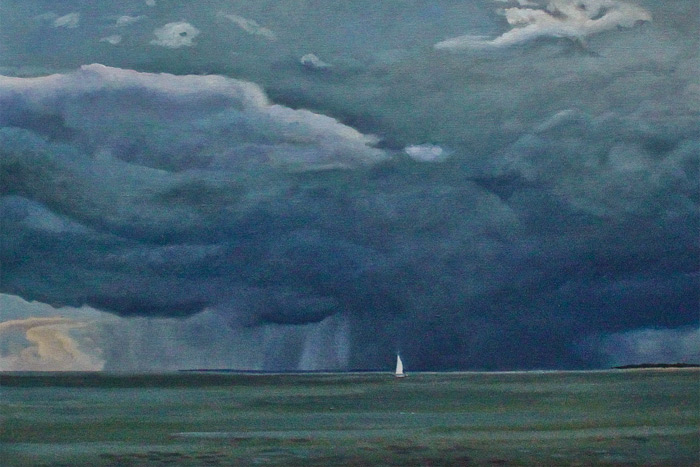
The cover painting, “Running Before the Storm,” has a lower horizon line than many of your other seascapes, and a more dramatic look, as patches of sunny blue sky yield to white puffy clouds that grow heavy with moisture as they descend to a dark green-and-blue sea. Was the sailboat really there?
It was. The boat was a particular delight as it allowed me to play with scale. I loved doing the sky, alluding to 19th century naturalism, which holds that man is but speck in the wider world of nature.
It’s all about the elements. I like to do similar scenes and play with different compositions of sky and sea. Here, I have four horizontal sections, elsewhere three or two. This painting, by the way, was in a show, “Views from Accabonac,” at Ashawagh Hall [in Springs] and sold even before the official opening.
Please compare your Long Island seascapes to those of Florida and Maine.
The sea has an endless variety of moods, hues, dimensions, so you can do almost anything you want. It’s one of the most difficult of all subjects to tackle, and yet at the same time the most liberating. The water on the East End is not as clear as that in Florida because of the brighter sand there, and there are different water depths to consider as well as the way the sun is reflected in the water.
You note that you do giclée—an expensive but highly rewarding process that uses a nine-color printer to faithfully reconstruct the original image.
If the paper used is top quality, then it’s fine, but I don’t go for printing out on canvas, mimicking the look of an oil painting. The kind of painting I love to do does not readily admit to producing variously sized print reproductions. On the other hand, if an artist works expressly toward giclée, the results could be worthwhile.
Smith’s work can be seen at the Chrysalis Gallery in Southampton and on davidlyttletonsmith.com.

Vetted Hamptons Resources