East End Tech: iOS 7 – Comparing Apples to Apples
Apple released the iPhone 5 a few weeks ago. Lots of people waited in line for it — no news there. For many, the bigger story was that Apple also released iOS 7 — an all-new operating system for versions 4 and later. This was a big deal. Apple promised lots of bells and whistles with the new UI, all of them designed to make smartphones smarter.
Did Apple hit the mark? Reviews are decidedly mixed. I really wanted to like iOS 7. But after 10 days of use, let’s just say this Apple doesn’t taste very sweet. Let’s use the classic Western film The Good, The Bad and The Ugly as our pop culture metaphor. Here we go.
The Good
The general look and feel of iOS 7 is great. My favorite new feature is the page swipe in Safari — instead of clicking back and forward buttons, just swipe left or right to navigate to previous pages. While we’re on the subject, Apple added a quick way to access the control center. Just swipe upward from the bottom of your home screen. This pulls up most popular features like Bluetooth, music, airplane mode and others without having to use multiple commands.
The speech-to-text feature also got better. I had no problems getting the phone to send relatively accurate text messages while driving—a key safety and convenience improvement. Or maybe I just had my window closed. Another nice add is the flashlight. I previously used an app that just turned your phone face into a white light. Now it’s built right in. It utilizes the camera flash for a bright, sharp beam.
The Bad
Okay, here we go. My main issue with iOS 7 is on the logic side. Commands that weren’t broken are now more difficult to use. Features that had simple, large buttons now have tiny little areas to tap that are placed on weird corners of the screen with really small text that’s hard to read.
Example 1: The phone lock code. It used to be simple: enter the code and press the large “OK” button right on the keypad overlay. Now, Apple moved that “OK” button way to the top of the screen, nowhere near the numbers or your thumb, and it’s so tiny it takes multiple attempts to engage. A small glitch, but my phone locks about 50 times a day, so it gets tedious.
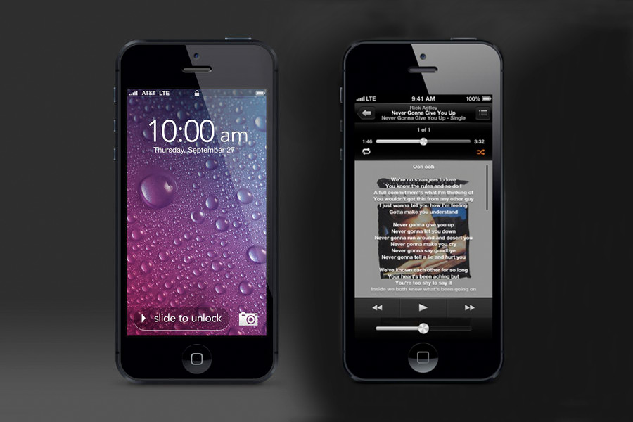
Example 2: The music player used to have simple commands for repeat and shuffle: large symbols that toggled on and off. In iOS 7 you need to press the repeat button, then read from a second pop-up menu of specific options. Stupid—why add more steps? Also, the settings never seem to stay in place; they constantly change back and forth.
Other inefficiencies abound. On email, you used to be able to swipe both left and right to delete a message, now it’s only left. To close an app, you now have to double tap the icon then swipe the screen up, adding another unnecessary step. And if you want to save, share or bookmark a link in Safari, you now need to tap the screen to access a hidden menu. Another unnecessary step.
I could go on, but I won’t. Just know that in many cases, iOS 7 makes you do more work than you should.
The Ugly
Wait. Everything Apple does is beautiful, remember? iOS 7 keeps with Steve Jobs’ design legacy—simple, clean, with bold colors and readable fonts. So instead of talking about the ugly, let’s discuss the weird.
First: Siri is a dude! Seriously. You can now choose the female version or a new male robot who sounds kind of like the computer in WarGames. (Supreme geek reference for all Matthew Broderick fans).
Second: The fingerprint code! Apple is pushing this hard—that’s why they made it so tough to manually enter a pass code. But this new feature has unleashed a lot of odd ID codes. People have made the ID work using cat paws, dog paws and yes random body parts that Howard Stern likes.
I still think iOS 7 does a lot of things well. This release shows how difficult it is to make meaningful improvements to technology. Short of adding teleportation, we’re going to have to get used to smaller upgrades.
Vetted Hamptons Resources